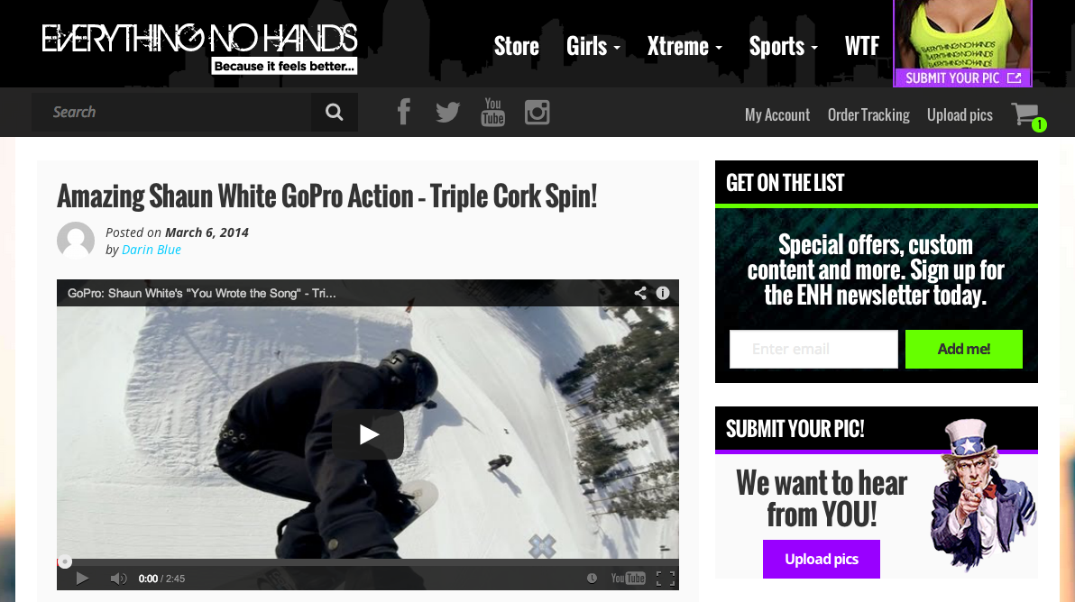
The CSS layout module flexbox is incredibly promising, but one of its main criticisms is the lack of a fallback for non-supporting browsers. Unlike border-radius, for example, where round corners will fallback to square corners, flexbox layouts will get completely messed up in most cases. Most, but not all.
Here is a simple use of flexbox I implemented recently on a commercial site, which gracefully degrades.


On the small screen, or mobile version, of the site—whichever is more PC these days—notice the header appears below the post excerpt, instead of above. This is done with the flexbox order property.
For browsers that don’t support flexbox, they see something like this:

This CodePen shows how it works, using Modernizr to style only for browsers that support flexbox.
See the Pen Simple flexbox use that degrades gracefully by paddyohanlon (@paddyohanlon) on CodePen.
There is design question as to whether this technique should be used as it is in this example. Is it right to flip the content like that?
The decision was made to have the image appear before title on small screens so people could see the featured image or video for the latest post above “the fold”. It makes sense as the site’s content, and business model, is focused around image and video based media. The majority of people accessing the site with a mobile device use an iPhone, and mobile Safari and Chrome now both support flexbox, so the primary mobile audience are delivered what is considered to be the best experience. Users with non-supporting devices still have access to the same content, they just have to scroll a little generally.
Further Flexbox Reading
- Using Flexible Boxes, MDN.
- A Complete Guide to Flexbox, CSS Tricks.
